JotForm 4.0
Re-thinking how web forms are created online
JotForm is an online form builder, allowing more than 2 million people to collect information and build better workflows for their companies, as well as accepting payments online.
The Problem
JotForm is a vast product that serves a huge variety of customers, so we started by interviewing users and identifying several archetypes to create various problem statements. After a while a pattern started to emerge and we arrived at an all-encompassing problem statement:
When I need to collect information, there are usually a lot of steps that require me to personally deal with them. I want to automate these processes and spend my time on something else.
Old version of JotForm could already automate a lot of tasks and the forms did actually help people save a lot of time.
However, after conducting a ton of usability tests and tracking various metrics across the board for quite a while, it was evident that the experience of creating a form was mostly time consuming and not quick at all.
What’s more, our analytics also pointed towards an increased interest from mobile users as well, receiveing almost 30% more traffic when compared to previous year. In the light if this, we conducted several street-level interviews to gauge interest in a form builder that you could use any where, any time and the responses showed that there was such a need in the market.
One particular story that caught our attention was from an event organizer, who convinced us to make responsiveness a priority and go mobile-first:
I was at a job fair as an employer and as soon as we set up shop at the event, the application form we prepared stopped working for some reason. We did not have any laptops with us, so we were stuck collecting applicant information throughout the whole day.
Talking to potential and current users, we were overflowing with ideas about how to make their experience better and laid them on a impact vs. effort matrix to decide on a couple of features for the future. We decided on Colloboration, Offline Capability, Simplified Designer and Continuous Save as our main improvements for JotForm 4.0.
Strategy
Our usability testing sessions had revealed that Discoverability and Findability was the most problematic areas, especially for new users, often causing people to miss important functionalty and get frustrated to the point of abandoning the product.
These tests also revealed a myriad of small to medium sized usability issues and inconsistencies, often relating to using wrong type of questions for user input.
These findings was the validation we needed to greenlight the project.
Through tracking user & form activity, we also discovered that nearly 30% of our customers would visit JotForm only every 2 months at best.
This indicated that repeat-users would often need to re-learn the product and the high learning curve of the old version would prevent people from discovering other features they might need; ultimately limiting the value people could get out of our product and damaging customer retention.
Henceforth, we founded our design strategy on these 3 pillars:
-
Aim for a low barrier of entry and learning curve by increasing the discoverability and findability of features, as well as utilizing progressive disclosure.
-
Achieve consistency through standardization of interaction patterns and creation of a UI Framework.
-
Allow people to build forms anywhere, anytime so that creating forms can become an important part of the daily workflow, like spreadsheets or word processors.
Clearly tracking our progress was important to make sure that we were on the right track, so we decided on Times Spent on Tasks, Task Difficulty Ratings, Context-Specific Conversion Rates and overall NPS scores as our UX KPIs. We also defined Retention Rate as our main Business KPI.
Kickoff & Elephants in a room
Obviously, planning is often easier than execution. Apart from the massive redesign, there was another elephant in the room: a legacy codebase built on an outdated framework.
Testing and iterating is our default mode of operation at JotForm. We’re big on continous development and design. However, with a legacy codebase which contained a tonne of well-documented lessons that had accumulated over the years, it meant that we couldn’t just jump right in and start developing a new product from scratch.
A roadmap was created, consisting of 16 different chunks of features varying at size, and one big-bad builder project, which is the core component that all smaller features would be connected to.
It was decided that the development would start by working on the smaller 16 components first to test the waters since we, as a company, were somewhat inexperienced with React and the myriad of other frameworks surrounding it.
This worked nicely with our plans for design, as it allowed for some leeway to start working on a UI kit and framework, aiming to ensure consistency between designers and speeding up the development process down the line.
Baby Steps & Prototyping
Starting with the smaller components meant that there had to be a transitionary phase for our current product, as they were all parts of a form building process and we achieved this by basically hijackking the functionality from the old builder, showing new wizard designs laid on top of the old screen as a modal window.
While it was not the nicest method to handle such a change, it was a development necessity to avoid the waterfall problem. One key benefit it offered was the ability to simultaneously A/B test several components at once and track various user engagement metrics.
The hardest part at this stage was striking a balance between the big number of features that was already available and keeping the interfaces clutter-free. We deferred a lot to our initial principles and heavily practiced progressive disclosure to improve our designs while keeping the product at roughly the same level of functionality.
Every screen that we designed went through extensive Usability and A/B tests at various stages.
The Fun Part - Hackathons
While all these 16 components took nearly a year to rebuild and redesign, we arranged semi-regular meetings about the design of the new form builder and consistently shared ideas and designs about what the end product might look like. This provided the team with a sense of direction and a sense of how all of the hard work would come together.
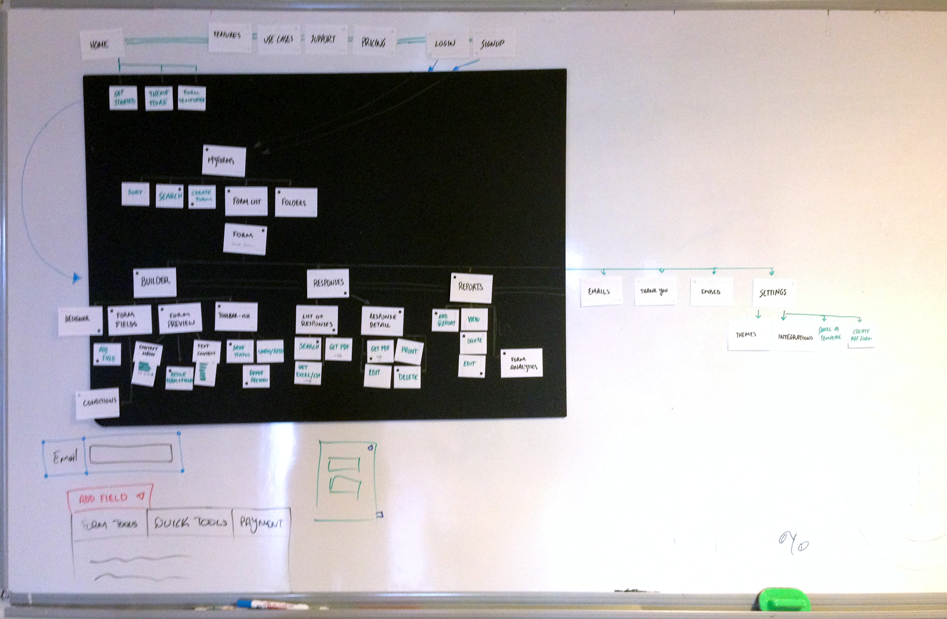 User flows from a whiteboarding session.
All designers were given complete creative freedom and access to user research during these designs as the point was to generate and test as many ideas as possible before delving further into the product.
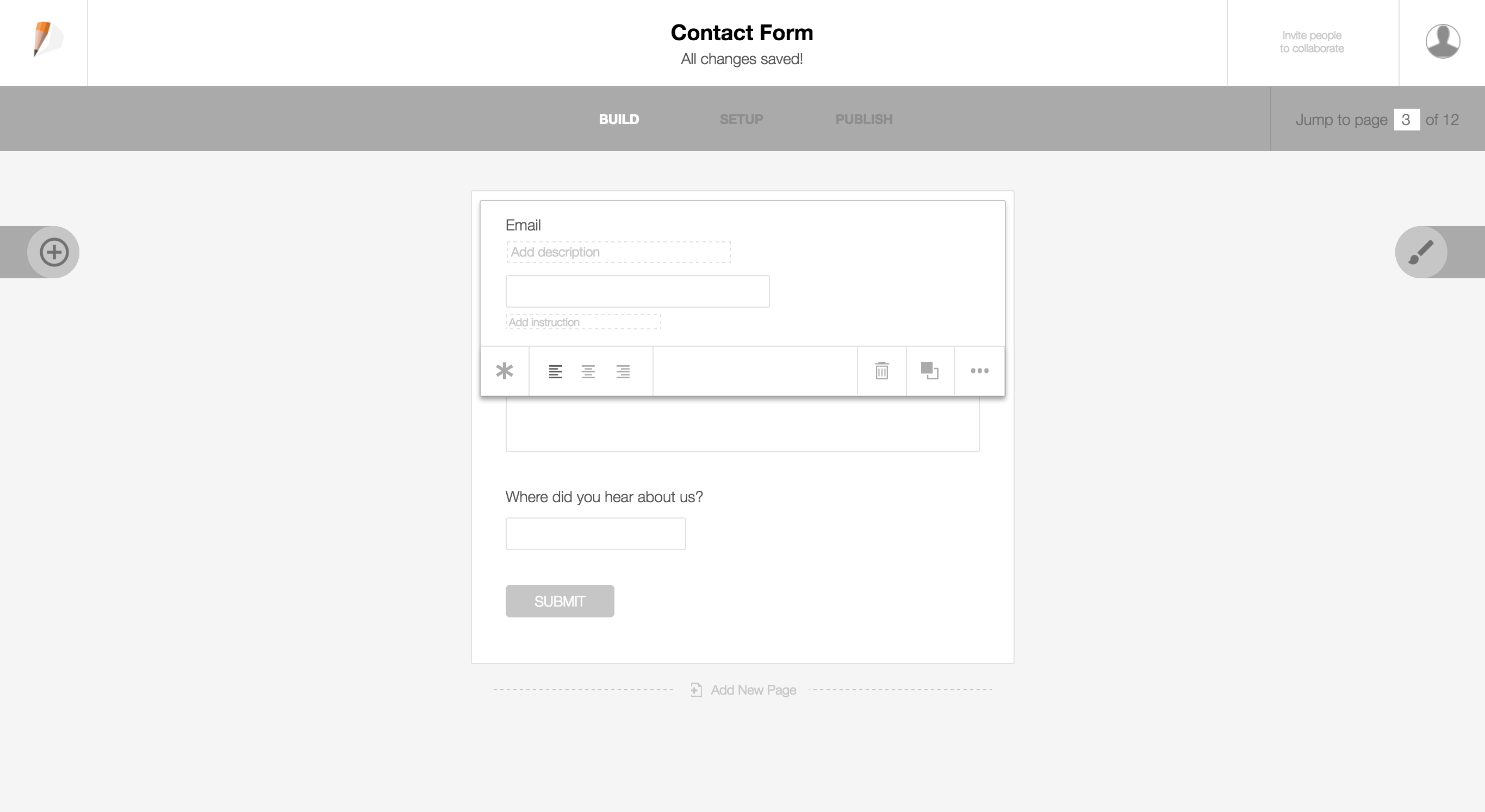 Initial wireframe of the build screen.
Since JotForm is a massive product, no amount of static prototypes could mimic the actual experience properly. That’s why we decided to hold hackathons to build quick and dirty, live prototypes in order to test various hypotheses we had regarding layout and features.
A total of 4 hackathons focused on different aspects of the product were held, and as a result we created 4 different working prototypes. Each design was tested with users and was ranked on how well the core mechanics of the design could address the initial problem statements.
Doubling Down and Building the Actual Product
These hackathons were incredibly successful in bringing us closer to solving “the problem”. Having 4 different designs, we were able to immediately identify common friction points, as well as mix and match solutions to various key tasks.
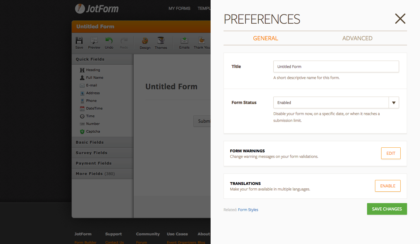
After months of hard work, and again a tonne of weekly usability tests we arrived at the launch version:
Next Project
Yekolay.com